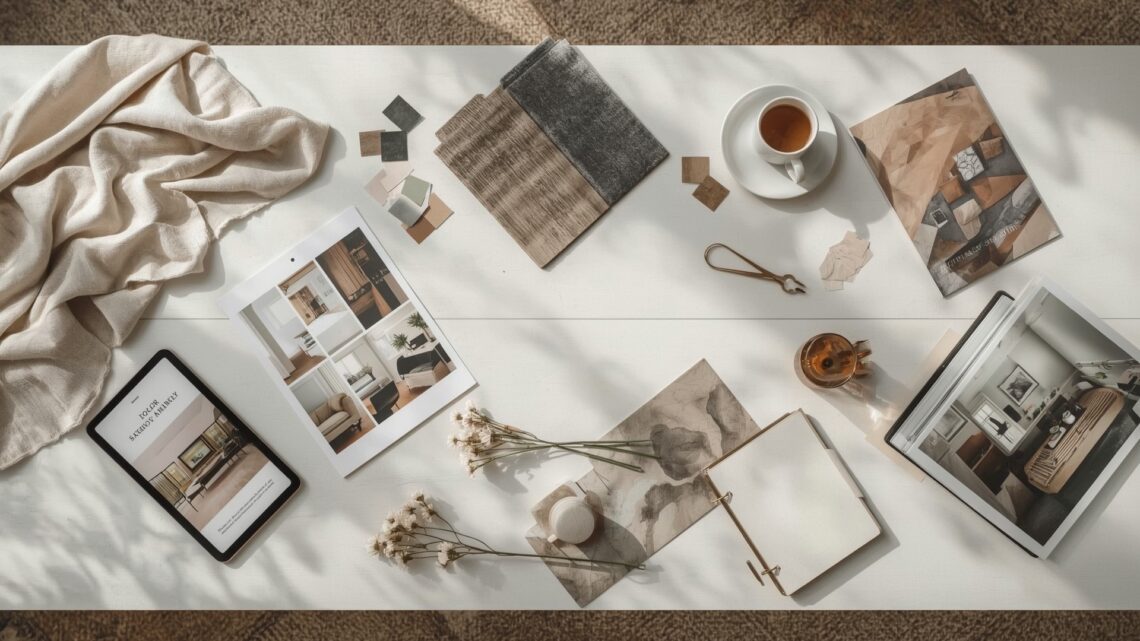
A mood board is the first real step in turning a vague design idea into something you can actually build. It collects your visual references, color preferences, textures, and furniture styles into one place — so you and your designer are speaking the same language from day one.
The good news: you don’t need design training to make one. You need the right process, the right tools, and a clear sense of what you’re trying to communicate. This guide walks you through every step.
Key Takeaways
- Start with your brief: Define the room, the function, and the feeling before you collect a single image.
- Use digital tools: Canva, Milanote, and Pinterest are the most accessible platforms for DIY mood boards.
- Limit your palette: Pull 3 to 5 colors from your images to keep the board focused and coherent.
- Mix source types: Combine room photos, material swatches, furniture pieces, and lifestyle images for a complete picture.
- Label everything: Your designer needs context — notes on what you love and what you want to avoid are just as useful as the images themselves.
- Share a file, not a screenshot: Export as a PDF or shared link so your designer can zoom in on details.
What Is an Interior Design Mood Board?

Quick Answer: A mood board is a visual collage that captures the style, color palette, materials, and atmosphere of a room you want to create. It acts as a shared reference between you and your designer, replacing vague descriptions with concrete visuals.
Think of a mood board as a visual shorthand. Instead of saying “I want it to feel cozy but modern,” you show images that prove it. That single shift from words to visuals eliminates a huge amount of misunderstanding early in a project.
A mood board can be physical — printed images pinned to a foam board — or digital, built inside a design tool. Digital boards are more practical for most homeowners because they’re easy to update, share, and rearrange without scissors and glue.
Mood boards serve two purposes. First, they help you clarify your own thinking. Second, they give your interior designer a verified starting point so they’re not guessing at your taste.
What Does a Mood Board Typically Include?
A complete mood board covers four content types:
- Room inspiration photos: Full room shots from design publications, Instagram, or Pinterest that capture the overall feeling you want.
- Material and texture samples: Fabric swatches, wood grain images, tile patterns, or upholstery options.
- Color palette: A set of extracted hex codes or paint chip references tied to what you’re seeing in your images.
- Furniture and fixture references: Specific pieces, or at least style references, for the key items in the room.
What Tools Should You Use to Build a Mood Board?
Quick Answer: Canva and Milanote are the best free tools for beginners. Pinterest works for collecting images but lacks layout controls. Adobe Express offers more design flexibility. Each tool takes under 30 minutes to learn at a basic level.
| Tool | Best For | Cost | Learning Curve | Export Options |
|---|---|---|---|---|
| Canva | Beginners, clean layouts | Free / Pro $15/mo | Very low | PDF, PNG, shared link |
| Milanote | Visual thinkers, flexible boards | Free / Pro $13/mo | Low | Shared link, image export |
| Image collecting, inspiration | Free | Very low | Board link only | |
| Adobe Express | Design-savvy users | Free / Premium $10/mo | Medium | PDF, PNG, JPG |
| Morpholio Board | Advanced users, material tracking | Free / Pro $10/mo | Medium | PDF, shared link |
Should You Use a Physical or Digital Mood Board?
Physical boards work well when you want to feel actual material textures — fabric, tile, wallpaper samples — before committing. They’re harder to share and impossible to update without starting over.
Digital boards are better for collaboration. You can share them instantly, update them in real time, and add notes that give your designer context. For most homeowners working with a professional, digital is the smarter choice.
How Do You Define Your Design Direction Before Collecting Images?

Quick Answer: Before saving a single image, answer four questions: What room is this? How will it be used? What mood should it create? What styles do you already own and need to work around? These answers become your filter for every image you collect.
This step is the one most people skip, and it’s why their boards end up scattered. If you start saving images without a filter, you’ll end up with a mix of coastal, industrial, and maximalist references that pull in three directions at once.
How to Write a Simple Design Brief for Yourself
A personal design brief doesn’t need to be formal. It’s just a short set of answers you write before opening any inspiration app. Cover these four points:
- The room: Primary bedroom, open-plan kitchen-living, home office.
- The function: How many people use it, how often, for what activities.
- The feeling: Calm and minimal, warm and layered, energizing and bold.
- The constraints: Existing furniture you’re keeping, flooring you can’t change, a budget ceiling.
With these four points written down, every image you collect can be tested against them. If a photo doesn’t fit your brief, it doesn’t go on the board — no matter how much you like it in isolation.
Where Should You Source Images for Your Mood Board?
Quick Answer: The best image sources are Architectural Digest, Dezeen, House Beautiful, Pinterest, and Instagram. Aim for 20 to 30 images, then edit down to the 10 to 15 that best match your brief. Quality over volume always wins.
Best Image Sources by Category
- Architectural and interiors publications: Architectural Digest, Dezeen, Wallpaper*, House Beautiful. These deliver professionally styled rooms with accurate color reproduction.
- Social platforms: Pinterest and Instagram for discovering emerging designers, real-home transformations, and niche styles.
- Retailer lookbooks: CB2, West Elm, Restoration Hardware, and Muuto publish styled room photography that doubles as sourcing reference.
- Designer portfolios: Houzz and individual designer websites show rooms with real project context — budget ranges, constraints, outcomes.
How Many Images Is Too Many?
Start with 20 to 30 images. Then apply your brief as a filter and cut everything that doesn’t clearly match the room, the function, and the feeling you defined. You should land at 10 to 15 images for a focused board.
If you can’t cut below 20, your brief isn’t specific enough. Go back and sharpen your feeling statement before moving forward.
How Do You Extract a Color Palette from Your Mood Board?
Quick Answer: Use Adobe Color, Coolors, or Canva’s color picker to extract dominant colors from your inspiration images. Limit your palette to 3 to 5 colors: one dominant, one secondary, one or two accents, and one neutral base. More than five creates visual noise.
| Color Role | Coverage % | Typical Application | Example |
|---|---|---|---|
| Dominant | 50–60% | Walls, large upholstery | Warm off-white, deep slate |
| Secondary | 20–30% | Rugs, curtains, cabinetry | Warm taupe, soft sage |
| Accent | 10–15% | Cushions, art, accessories | Terracotta, dusty rose |
| Neutral Base | Underlying | Trim, ceilings, grout | Crisp white, warm cream |
How to Use Hex Codes to Communicate Your Palette
When you share colors with your designer or a paint supplier, use hex codes — the 6-character codes (like #F5ECD7) that identify exact shades. Every color palette tool generates these automatically.
Hex codes remove ambiguity. “Warm beige” means different things to different people. #E8D5B7 means exactly one thing.
What Color Tools Work Best for Beginners?
- Adobe Color: Upload any image and it extracts the five most dominant colors with hex codes. Free at color.adobe.com.
- Coolors: Generates palette combinations and lets you lock in colors you’ve chosen. Free at coolors.co.
- Canva Color Palette Generator: Upload a photo and get an instant palette. Works inside the same tool you’re using to build your board.
How Do You Organize Images and Materials on Your Board?
Quick Answer: Group your board into three zones: atmosphere (full room photos), palette (color swatches and textures), and specifics (individual furniture and fixture references). This structure lets your designer scan the board in under two minutes and understand your intent at every level.
What Layout Structure Works Best?
The most effective mood board layouts follow a simple three-zone logic:
- Atmosphere zone (left or top): Two to three full room images that set the overall feeling. These are your North Star images — every other decision gets tested against them.
- Palette zone (center): Color swatches, material textures, and finish references arranged together so relationships are visible.
- Specifics zone (right or bottom): Individual furniture pieces, light fixtures, hardware, and accessories you’re actually considering or that represent the style you want.
Should You Add Text and Labels to Your Mood Board?
Yes — labels make your board significantly more useful to a designer. For each image or cluster, add a short note explaining what you love about it and what you’d adapt or avoid.
For example: “Love the shelf depth and the matte finish. Don’t want the open back — prefer closed storage.” That single note saves 20 minutes of back-and-forth in a briefing session.
How Do You Add Material and Texture References?

Quick Answer: Screenshot or photograph physical samples — linen, oak veneer, matte ceramic, brushed brass — and add them to your board alongside your room images. Material references tell your designer how a space should feel to touch, not just how it should look.
| Material | Texture Quality | Common Application | Style Associations |
|---|---|---|---|
| Linen | Matte, slightly rough | Upholstery, curtains | Coastal, Scandinavian, organic |
| White Oak Veneer | Smooth grain, warm tone | Cabinetry, flooring, furniture | Japandi, modern organic |
| Matte Ceramic | Flat, slightly chalky | Tile, tableware, accessories | Earthy, handcrafted, Mediterranean |
| Brushed Brass | Soft sheen, warm metallic | Fixtures, handles, light fittings | Traditional, transitional, warm modern |
| Bouclé Fabric | Looped, textural, soft | Accent chairs, sofas | Contemporary, cozy modern |
| Honed Marble | Flat stone, cool weight | Countertops, flooring, feature walls | Luxury, classical, transitional |
How Do You Find Digital Material Swatches?
Most major tile, fabric, and flooring brands publish high-resolution swatch images on their websites. Search the product name plus “texture swatch” or “detail shot” to find close-up photography that reads clearly on a mood board.
Retailers like Fireclay Tile, Maharam, and Fermoie offer sample programs where you can order physical samples, photograph them against each other, and upload those photos directly to your digital board.
How Do You Refine Your Mood Board Before Sharing It?
Quick Answer: Edit your board down to 10 to 15 images, check that every element matches your brief, confirm your palette has no more than 5 colors, and add at least one note per section. A tight, annotated board communicates faster and more clearly than a large, unlabeled one.
What Should You Remove from Your Board?
Cut any image that meets one of these four conditions:
- It contradicts the feeling you defined in your brief.
- You saved it because the image was beautiful, not because the style was relevant.
- It introduces a style direction that nothing else on the board supports.
- It’s redundant — another image already shows the same thing more clearly.
What Does a Strong Mood Board Look Like vs. a Weak One?
| Element | Strong Mood Board | Weak Mood Board |
|---|---|---|
| Image count | 10 to 15, curated | 30+, uncurated |
| Style coherence | One clear direction | Multiple conflicting styles |
| Color palette | 3 to 5 defined colors with hex codes | No palette, colors clash |
| Material references | Included with texture detail | Missing or generic |
| Labels and notes | Present on all sections | None |
| Export format | PDF or shared link with full resolution | Screenshot, low resolution |
How Do You Share a Mood Board With Your Interior Designer?
Quick Answer: Export your board as a PDF or send a shared edit link from Canva or Milanote. Always include a short written summary of what you love and what you want to avoid. Avoid sending screenshots — low resolution hides the details your designer needs to see.
What Context Should You Provide When Sharing?
Send the board with a short paragraph — three to five sentences — that covers three things:
- The primary feeling you want: “I want this room to feel calm and uncluttered, like a hotel suite.”
- The elements you feel strongly about: “The texture in image three is non-negotiable — I want that kind of warmth in the flooring.”
- Your biggest concern: “My main worry is that it ends up looking cold. I’d rather it be warmer than cooler if we have to choose.”
How Should Your Board Evolve After Designer Feedback?
Treat your mood board as a living document, not a final submission. Your designer will likely ask you to add or remove elements, or create a version two that responds to budget or spatial constraints.
Keep a copy of your original board so you can compare it to revised versions. Sometimes the elements that get edited out early are the ones that matter most to you — and seeing that gap helps you advocate for them.
What Are Common Mood Board Mistakes to Avoid?
Quick Answer: The most common mistakes are collecting too many images, mixing incompatible styles, skipping material references, and sharing without notes. Each mistake forces your designer to interpret your intentions instead of acting on them — which costs time and increases the chance of misalignment.
The Five Most Common Mood Board Mistakes
- No design brief: Collecting images without a brief produces a scattered board that reflects your browsing history, not your actual vision.
- Style mixing without intent: Combining coastal and industrial references might reflect genuine taste, but it needs a note explaining how you want them to blend — otherwise your designer has to guess.
- Skipping textures and materials: A board of room photos with no material detail tells a designer how a room looks but not how it should feel. Tactile references are essential.
- No color extraction: Letting your designer interpret the colors from your images introduces variables. Pull a palette and name it.
- Over-sharing on Pinterest: A Pinterest board with 200 pins is not a mood board. It’s a starting collection. You still need to curate, layout, and annotate.
Frequently Asked Questions
Do I need design experience to make a mood board?
No design experience is required. The tools available — Canva, Milanote, Pinterest — are built for non-designers. The skill involved is curation, not technical design. If you can clearly describe what you like and dislike, you can build an effective mood board.
How long does it take to build a mood board?
Most homeowners complete a first-draft mood board in two to four hours. That includes 30 to 60 minutes of image collection, 30 minutes of editing and layout, and 30 minutes of color extraction and annotation. A polished, designer-ready version typically takes one to two rounds of refinement after that.
Can I use a mood board even if I’m not hiring a designer?
Absolutely. A mood board is useful for DIY projects too. It keeps your purchasing decisions coherent and prevents impulse buys that don’t fit the overall direction. Think of it as a self-imposed filter before anything goes in your cart.
What is the difference between a mood board and a concept board?
A mood board focuses on feeling, color, and atmosphere. A concept board, used by professional designers, layers in spatial planning, specific product specifications, and technical drawings. Mood boards come first and feed into concept boards during the design development phase.
Should I include furniture I already own in my mood board?
Yes. Photograph any existing furniture, rugs, or art that you’re keeping, and include those photos in your board. Your designer needs to know what they’re working around. Items you already own become constraints — and constraints are valuable information.
How many mood boards should I make per room?
One focused board per room is usually enough to start. If you’re genuinely torn between two directions — say, a warm earthy palette versus a cooler minimalist one — create two separate boards and present both. A clear either/or is easier for a designer to respond to than a single mixed board.